LocaMos Mobile App
Mobile App Design
Web Design
EXPLORE
EXPLORE
EXPLORE
LocaMos App Redesign – 100 Screens in 30 Days with Systematic UX Thinking
Overview
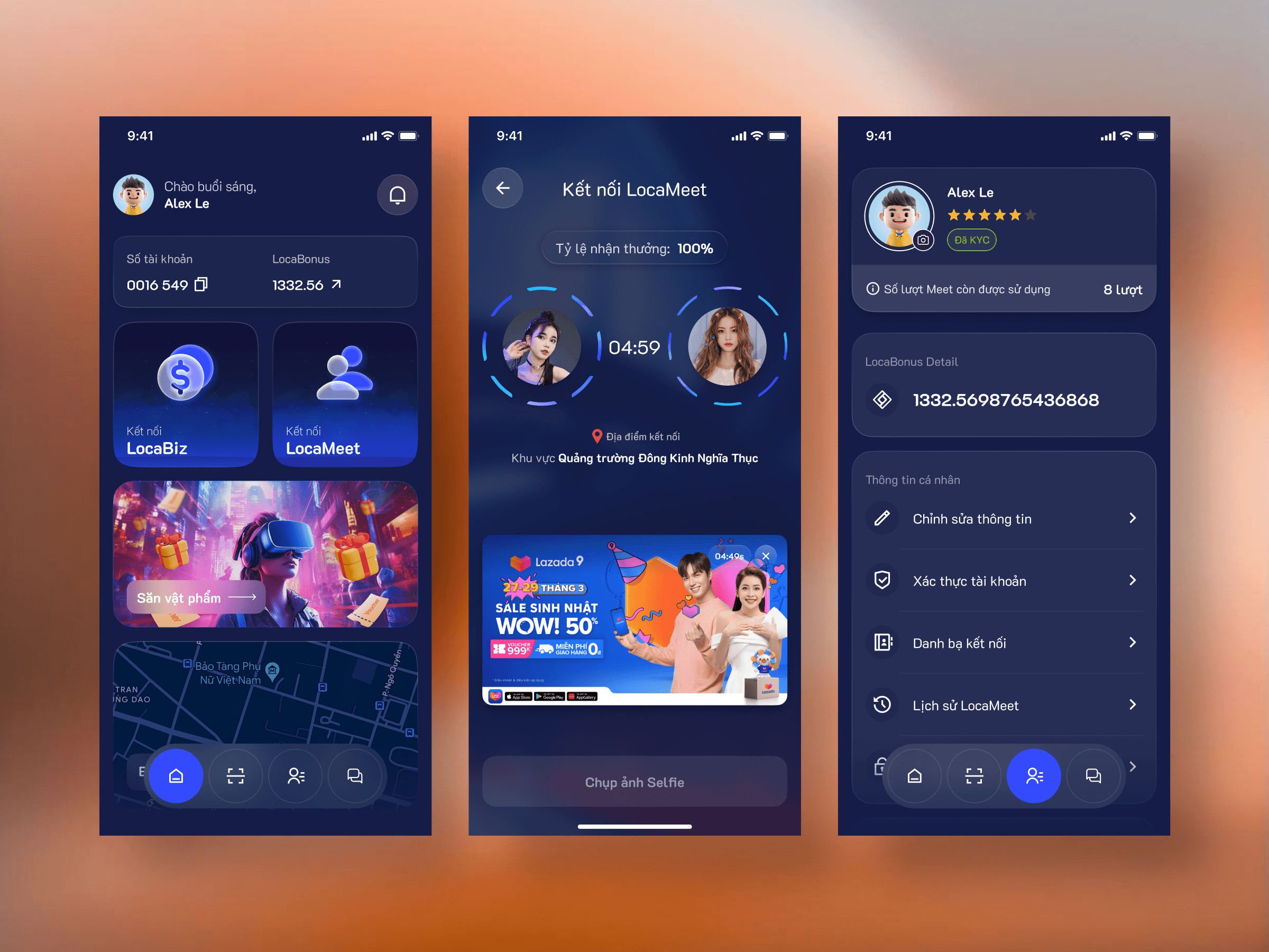
LocaMos is a mobile application that combines augmented reality (AR) and virtual reality (VR) technology to bridge the gap between the digital and real worlds. As the UI/UX Lead, I was tasked with a complete redesign of the app to modernize the interface, align with updated branding guidelines, and enhance the overall user experience.
The goal was to reflect LocaMos as a tech-driven, reliable, and user-friendly platform, while tackling significant design and time challenges.
The Challenge
The redesign project came with several high-pressure constraints:
Outdated UI with inconsistent design patterns and poor branding alignment
A confusing and fragmented user experience across different flows
Over 100 screens required redesign within just 30 days
Coordination with multiple stakeholders and development team under tight timelines
The biggest challenge was delivering quality, consistency, and speed—all at once.
My Role
Role: UI/UX Lead
Team: 1 Product Manager, 1 UX Researcher, 2 UI Designers
I was responsible for the end-to-end redesign strategy, component system, visual direction, design execution, and handoff.
⚙️ Design Process
1. UI/UX Audit
We began by reviewing the existing app to identify usability issues, visual inconsistencies, and key UX pain points across main user flows like meeting management, payment, and onboarding.
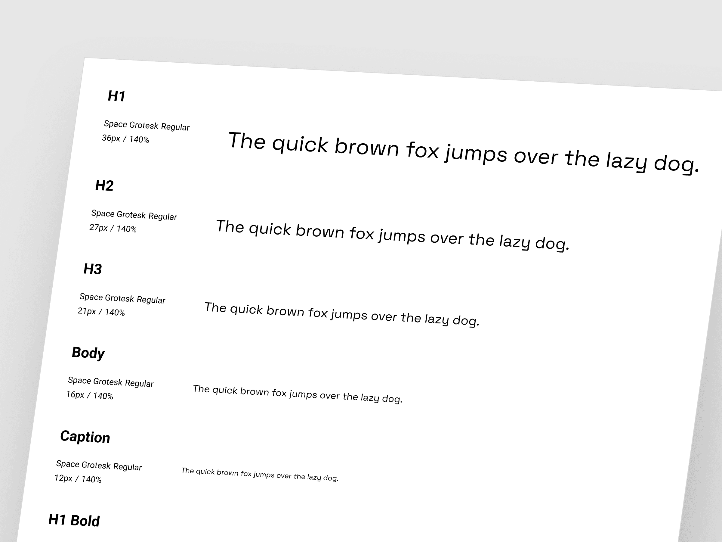
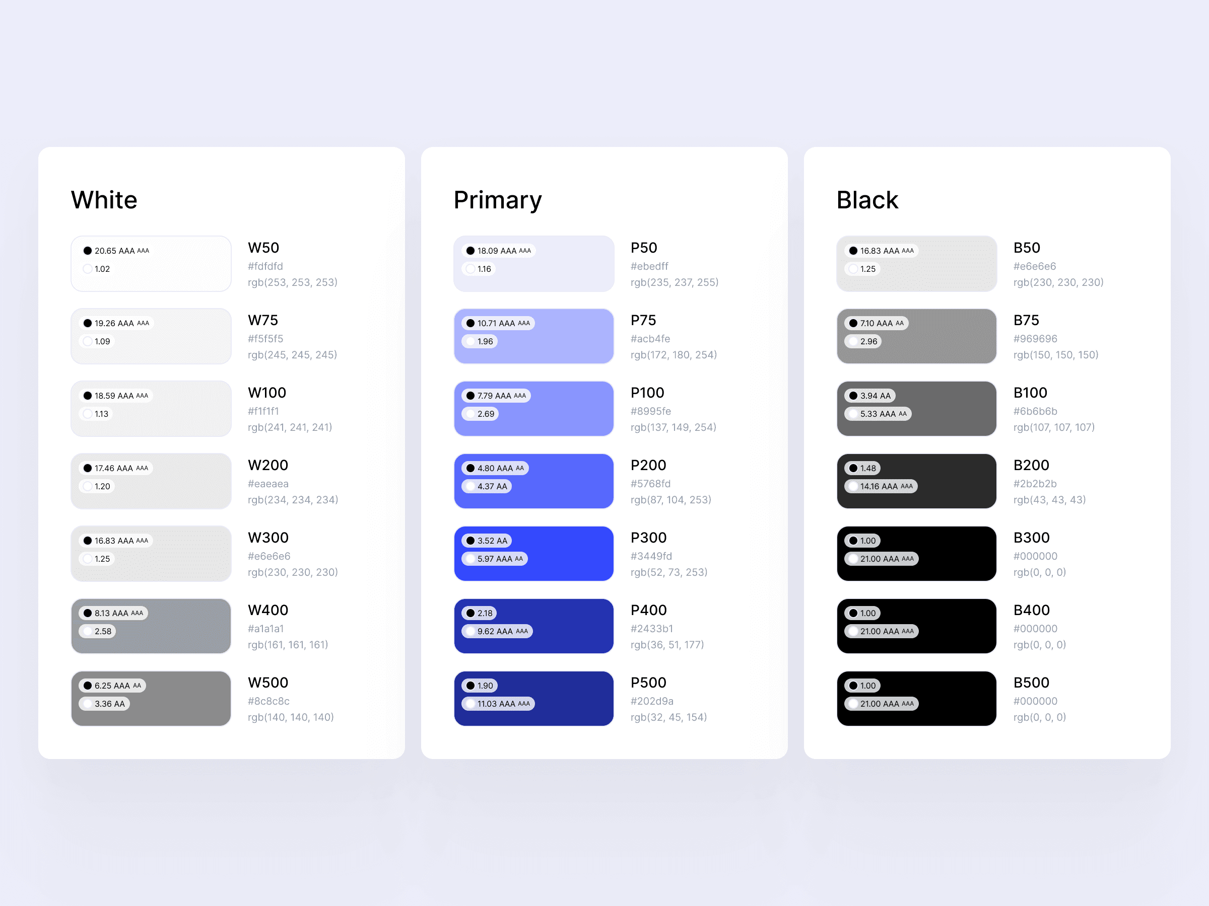
2. Design System First
To accelerate the design process, I created a component-based design system from the start—defining typography, spacing, color palettes, buttons, input fields, and UI patterns.
➜ This allowed us to design and maintain over 100 screens efficiently with visual consistency.
3. Flow-Based Prioritization
We divided the 100+ screens into key flows and prioritized based on usage frequency and business impact.
➜ High-traffic flows were redesigned and validated first before expanding to supporting screens.
4. Parallel Design & Review Loop
To keep momentum, we worked in design–review–adjust loops every 48 hours, using Figma comments and async check-ins with the PM and developer.
➜ This eliminated bottlenecks and kept feedback cycles fast and focused.
5. Internal Prototyping & QA
We built interactive prototypes to test new flows internally before handoff. The design system helped developers implement faster with minimal back-and-forth.
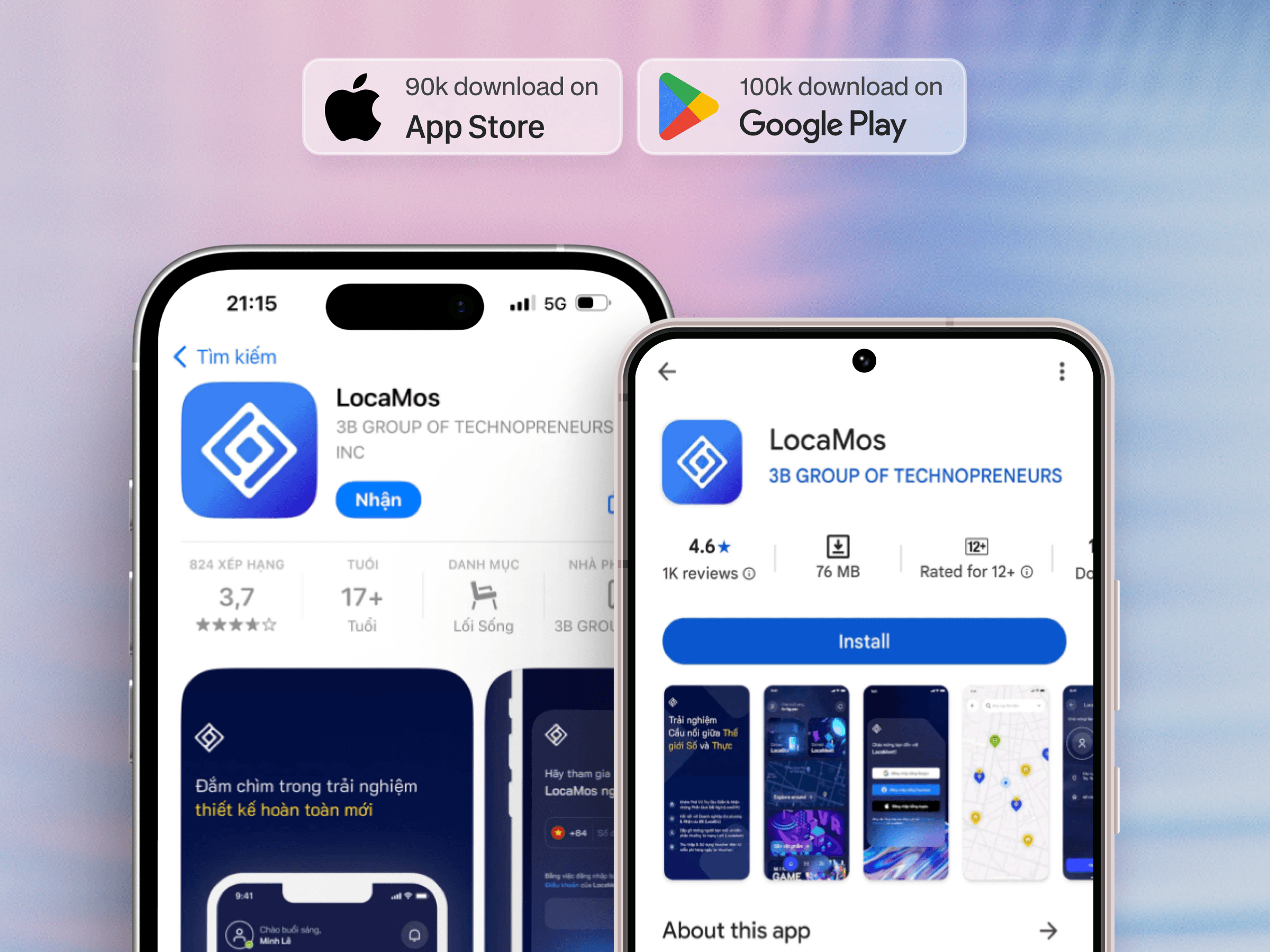
Download on Apple Store / Google Play Store
Results & Impact
Completed 100+ redesigned screens within the 30-day deadline
Delivered a modern, cohesive interface aligned with brand identity
Developer handoff was smooth due to component clarity and system thinking
Post-release user feedback showed significant improvement in usability
App Store rating increased from 3.2 to 4.1 within the first month of launch
Stakeholders praised the clean visual direction and consistent user journey
Reflection
This project reinforced the importance of systematic thinking in high-pressure design timelines. By building a scalable design system and managing scope through flow-based priorities, I was able to guide the team to deliver both speed and quality.
It wasn’t just about redesigning screens—it was about designing a scalable experience that worked for both users and developers.